For as long as web developers have been writing stylesheets, there has been one persistent request: “Why can’t I just use an if statement?”.
We are used to declarative programming in CSS. We state what we want, color: red; and the browser paints it. But the moment we need dynamic behavior, things get complicated. We’ve relied on a history of workarounds. We used Sass and Less to compile logic on the server. We cluttered our HTML with modifier classes like .btn–primary or .is-active. We even invented the incredibly clever (but mind-bending) “Space Toggle” hack involving empty CSS variables to mimic boolean logic.
Those days are finally numbered.
The CSS Working Group and the Chrome team have officially shipped a prototype for the if() function. This isn’t a pre-processor; this is native, browser-engine logic that lives directly inside your property values.
This feature represents a fundamental shift in how we architect design systems. It moves the logic from the HTML (classes) and the Pre-processor (Sass) directly to where it belongs: the styling rule itself.In this guide, we are going to look under the hood of the new CSS if() function. We will explore how it works, how it replaces the hacks of the past, and how you can start testing it today in Chrome Canary.
You might me interested in: CSS Grid vs. Flexbox
Understanding the Syntax: How if() Works
At its core, the CSS if() function functions very similarly to the ternary operator found in JavaScript (condition ? true : false). It evaluates a condition and returns one value if that condition matches, and a different value if it does not.
The basic syntax looks like this:
CSS
property: if(condition ? <true-value> : <false-value>);It is important to note that currently, the if() function is designed to work specifically with Custom Properties (CSS Variables) and Media features. It allows you to query the state of the CSS environment inline.
The Arguments
- The Condition: This is the query you are testing. Currently, the prototype supports style() queries (checking variable values) and media() queries (checking viewport specs).
- The True Value: The value applied if the condition is met.
- The False Value: The value applied if the condition is not met (the fallback).
Why “Inline” Matters
Previously, if you wanted to change a button’s color on mobile devices, you had to exit your current rule block and open a new @media block:
CSS
/* The Old Way */
.button {
  font-size: 16px;
}

@media (max-width: 600px) {
  .button {
    font-size: 14px;
  }
}
With the new syntax, the logic is nested inside the property, keeping your code readable and co-located:
CSS
/* The New Way */
.button {
  font-size: if(media(max-width: 600px) ? 14px : 16px);
}
Deep Dive: The Two Types of Conditionals
To fully utilize this function, you need to understand the two types of queries available within the parent if() function: Style Queries and Media Queries.
1. Style Queries (style())
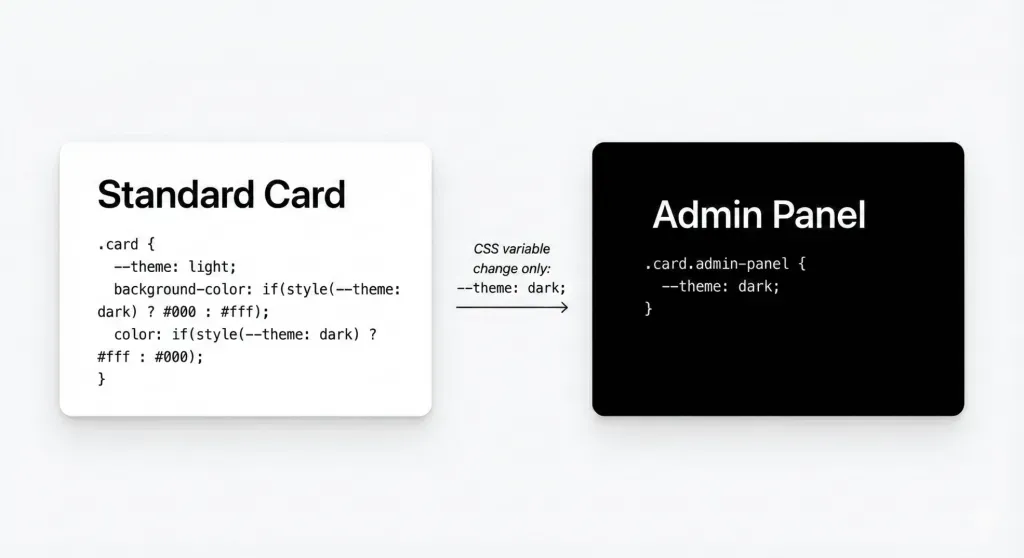
Style queries are perhaps the most powerful aspect of this update because they allow components to style themselves based on their own custom properties. This is the feature that effectively kills the need for multiple modifier classes.
The Syntax: if(style(–variable: value) ? result : else)Imagine you are building a card component. Instead of creating .card, .card-dark, and .card-compact, you can define variables and let the CSS handle the logic.
CSS
.card {
  /* Define defaults */
  --theme: light;
  --layout: standard;

  /* Logic based on the --theme variable */
  background-color: if(style(--theme: dark) ? #000 : #fff);
  color: if(style(--theme: dark) ? #fff : #000);

  /* Logic based on the --layout variable */
  padding: if(style(--layout: compact) ? 1rem : 2rem);
}
If you want to change the card to dark mode, you don’t change the class in HTML; you simply update the variable:
CSS
.card.admin-panel {
  --theme: dark;
}
2. Media Queries (media())
Inline media queries bring responsive design down to the property level. This is incredibly useful for typography and grid layouts where you want slight adjustments without writing verbose @media blocks at the bottom of your file.
The complete media query breakpoint guide in bootstrap
The Syntax: if(media(feature: value) ? result : else)
This is particularly useful for properties like gap, font-size, or display.
CSS
.container {
  display: flex;
  /* Switch direction based on screen width inline */
  flex-direction: if(media(width < 768px) ? column : row);

  /* Adjust gap based on screen width */
  gap: if(media(width < 768px) ? 1rem : 2rem);
}
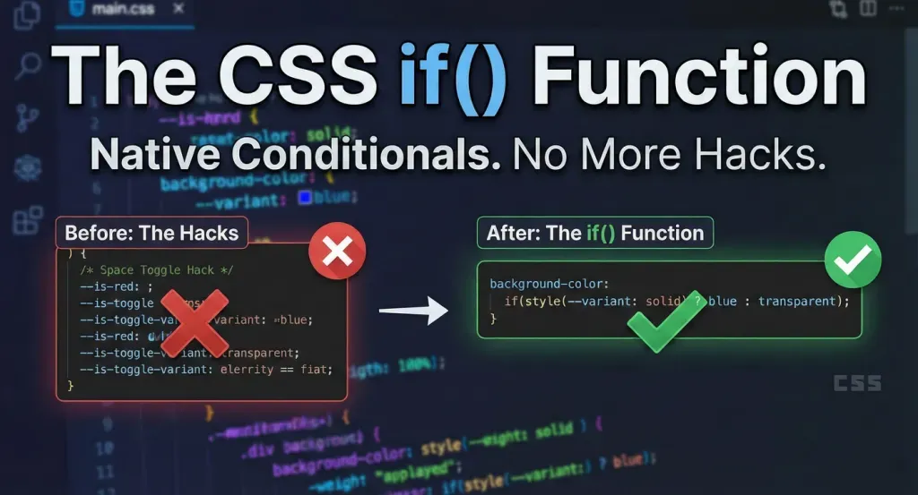
The “Space Toggle” Hack vs. The if() Function
To appreciate the elegance of if(), we have to acknowledge the complexity of what we are currently doing. Advanced CSS developers have been using the “Space Toggle” hack to achieve boolean logic.
The Old “Hack” Way: This technique involved setting a variable to a specific whitespace value to “turn on” a fallback.
CSS
/* Space Toggle Hack - Confusing and brittle */
--is-red: ; /* Space turns it "on" */
--is-blue: initial; /* Initial turns it "off" */
background-color: var(--is-red, red) var(--is-blue, blue);
If you look at that code and feel confused, you are not alone. It relies on exploiting how CSS parsers handle invalid variables. It is clever, but it is difficult to read and even harder to maintain.
The New if() Way: The new function replaces that cognitive load with readable, human-understandable syntax.
CSS
background-color: if(style(--color: red) ? red : blue);
There is no ambiguity here. Any developer, regardless of their experience level with deep CSS hacks, can read this line and understand exactly what is happening.
Practical Examples: Refactoring Common Patterns
Let’s look at three real-world scenarios where if() drastically simplifies your codebase.
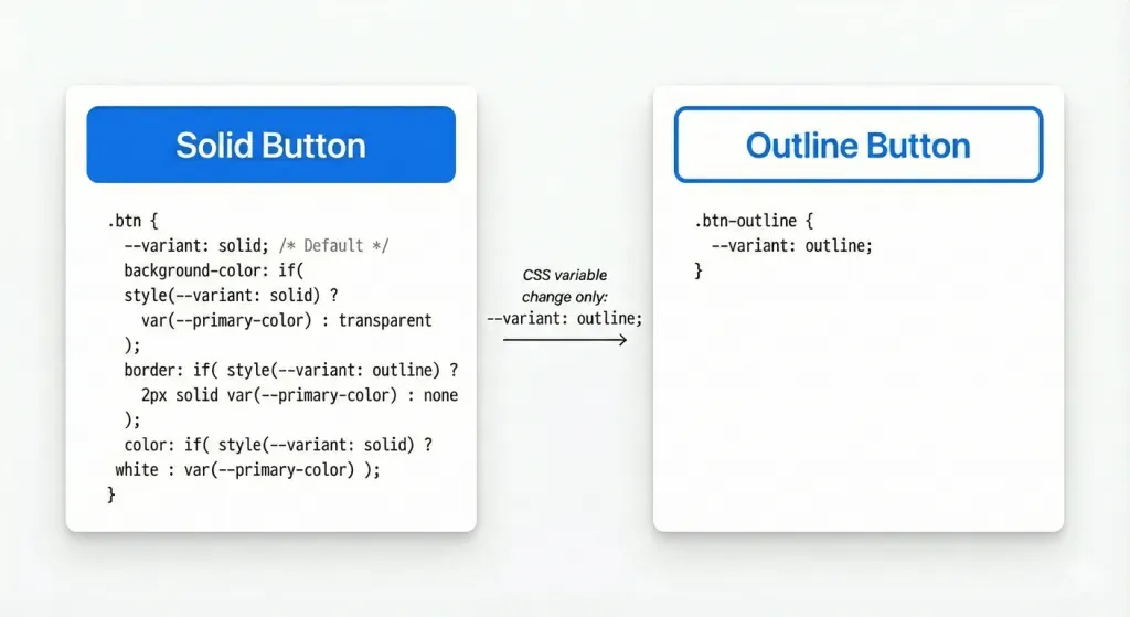
Scenario 1: The “Ghost” Button
Design systems often have “Solid”, “Outline”, and “Ghost” buttons. Traditionally, this requires a base class and variant classes.With if(): You can handle the logic entirely within the border and background properties.
CSS
.btn {
  --variant: solid; /* Default */

  background-color: if(
    style(--variant: solid) ? var(--primary-color) : transparent
  );

  border: if(
    style(--variant: outline) ? 2px solid var(--primary-color) : none
  );

  color: if(
    style(--variant: solid) ? white : var(--primary-color)
  );
}
Now, setting <div class=”btn” style=”–variant: outline”> is all you need to do to switch styles.
Scenario 2: Responsive Typography (Fluid Type)
We often use clamp() for fluid typography, but sometimes we want distinct steps (breakpoints) rather than fluid math.
CSS
h1 {
  font-size: if(
    media(width > 1200px) ? 4rem :
    if(media(width > 600px) ? 2.5rem : 1.5rem)
  );
}
Note: The example above demonstrates nesting, which is theoretically possible but should be used sparingly for readability.
Scenario 3: Grid Logic
Changing grid columns usually requires redefining the grid-template-columns property in media queries.
CSS
.grid {
  display: grid;
  /* 3 columns on desktop, 1 on mobile */
  grid-template-columns: repeat(
    if(media(width > 800px) ? 3 : 1),
    1fr
  );
}
Browser Support and How to Test (Chrome Canary)
We must address the elephant in the room: Support.As of late 2025, the CSS if() function is in the experimental prototype phase. It is not part of the official W3C CSS specification yet, but it has been implemented in Chrome Canary behind a flag for testing.
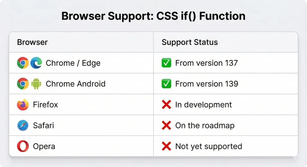
This means:
- Do not use this in production. It will not work for 99% of your users.
- Syntax may change. The spec is still being debated.
- It is for prototyping. This is the time to experiment and provide feedback to the CSS Working Group.
How to enable it:
- Download Chrome Canary.
- Go to chrome://flags.
- Search for “Experimental Web Platform features”.
- Enable it and restart the browser.
The Future of Design Systems
The introduction of if() is part of a larger movement in CSS towards “State-Driven Styling.”
When we combine if() with Container Queries, CSS Nesting, and Scope, we are approaching an era where CSS becomes a fully capable language for managing the presentation layer’s logic.
This reduces the reliance on JavaScript for styling. Currently, we often use React or Vue to toggle classes like is-open or is-active. While that won’t go away entirely, if() allows the CSS to “react” to its own variables.
Imagine a JavaScript component that simply updates a single style variable style=”–state: success”, and the CSS handles the icon change, the border color, the background pulse, and the text color—all through internal if() logic. This decouples your JS logic from your specific design implementation.
Conclusion
The CSS if() function is more than just syntax sugar; it is a graduation for CSS. It marks the transition of CSS from a purely declarative list of rules to a logic-aware styling language.
While we are likely a year or two away from full cross-browser support, the ability to write conditional logic inline is going to revolutionize how we write, maintain, and scale CSS.
You might be interested in this topic as well.
1. Best CSS Animation Libraries for Web Developers
2. Mastering CSS Selectors: Essential Tools for Frontend Developers
3. 5 Advanced CSS Tricks to Enhance Your Web Design


Leave A Reply