

Best Tools for Testing Responsive Web Design in 2026 (Free and Paid)
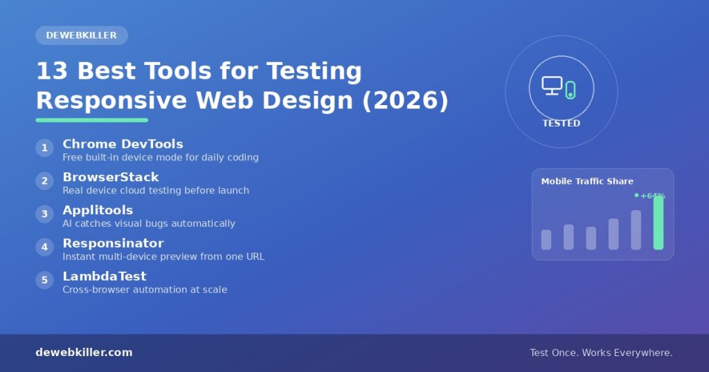
For a fast visual check, try Responsinator or Responsive Design Checker. Developers should lean on Chrome DevTools and Firefox Responsive Design Mode, since both are free and built into the browser. Teams preparing for launch can turn to BrowserStack or LambdaTest for real device coverage. And if you ship updates often, Applitools or Percy will catch layout bugs automatically through AI visual testing.
Now let’s dig into why this matters and cover every tool worth using this year.
Why Responsive Testing Still Matters in 2026
A website can look flawless on a 27 inch monitor and still fall apart on a budget Android phone. That gap is exactly what responsive testing tools catch. Mobile devices generate more than half of all global web traffic today, and in several regions that figure climbs past 70 percent. Google also crawls and ranks the mobile version of your page first, so a broken mobile layout can quietly hurt both user experience and search visibility.
As a web designer, you cannot own every phone, tablet, and laptop on the market. Responsive testing tools solve that problem by simulating different screen sizes on demand. With the right tool, you can spot broken menus, overlapping text, and images that refuse to scale before a real visitor ever sees the issue.
One thing has changed since this guide first went live. Google retired its own Mobile-Friendly Test tool along with the Search Console Mobile Usability report back in December 2023. Site owners are now pointed toward Lighthouse and PageSpeed Insights instead, so we updated this list and dropped a few tools that no longer hold up.
Below are the best tools for testing responsive web design this year, grouped by how you would actually use them.
Browser Based Tools (Free, No Signup)
These live inside browsers you already use, which makes them the fastest starting point while you are actively coding.
1. Chrome DevTools Device Mode
Chrome’s built in Device Mode remains the most used responsive testing tool among developers, and for good reason. Press F12 or Ctrl+Shift+M to open it, then choose from a list of real device presets or set a fully custom viewport. Network throttling, touch emulation, and device pixel ratio controls are all built in too, so you can see how a page behaves on a slow connection, not just how it looks.
Best for: developers testing while they write code.
2. Firefox Responsive Design Mode
Firefox ships a similar feature under its Developer Tools menu. This mode renders your page at different breakpoints and lets you inspect CSS media queries directly, making it a strong companion to Chrome DevTools rather than a replacement for it. Running both browsers side by side helps catch rendering differences between engines that a single tool would miss.
Best for: cross browser breakpoint comparison.
3. Safari Web Inspector Responsive Design Mode
If you support iOS users, Safari’s Web Inspector deserves a look at least once per project. Apple’s own rendering engine sometimes reveals quirks that Chrome and Firefox miss entirely, since Safari handles certain CSS properties differently. Opening the Web Inspector lets you simulate iPhone and iPad viewports directly, without needing physical hardware.
Best for: catching Safari and iOS specific layout bugs.
Online URL Based Checkers (Free, No Install)
Paste a URL and get an instant multi device preview. These work well for a quick sanity check or a client demo when you don’t want to open developer tools.
4. Responsinator
Responsinator remains one of the simplest tools available. Type in a website address, and the tool instantly renders your page across popular smartphones and tablets in both landscape and portrait orientation. Consider it a solid first pass before you dig into DevTools for finer detail.

5. Am I Responsive
Am I Responsive displays your site on a desktop, laptop, tablet, and phone within a single composite screenshot. Detailed QA work isn’t really its strength, but the clean visual output works well in client presentations and portfolio pieces. Many designers keep this bookmarked purely for that reason.

6. Screenfly
Screenfly covers desktops, tablets, phones, and even televisions from one dashboard. You can pick a specific device or set a custom resolution, which gives it more flexibility than a fixed device list. That extra control makes it useful when you need an uncommon screen size.

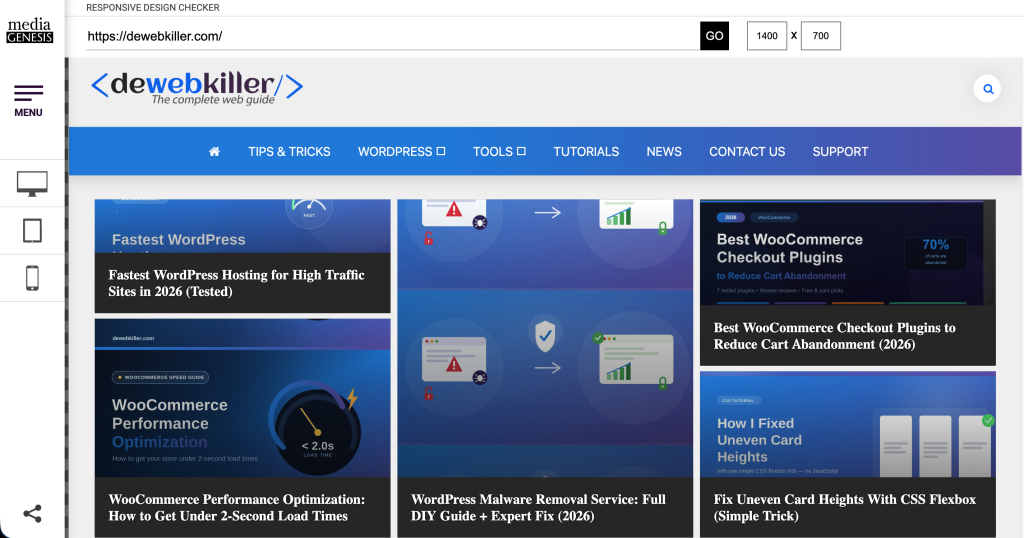
7. Responsive Design Checker
Responsive Design Checker is a newer, actively maintained alternative to older tools on this list. The tool renders a URL across a wide range of predefined viewports for a fast visual review. Solo developers often use it as a first filter before running deeper, more detailed tests.
AI Powered Visual Testing (For Teams That Ship Often)
This is the biggest shift since 2020. Manual resizing does not scale once a team pushes frequent updates, so AI visual testing has become standard practice for catching regressions automatically.
8. Applitools
Applitools uses AI to compare screenshots across builds, flagging real visual bugs while ignoring harmless pixel differences like anti aliasing. Most CI/CD pipelines integrate with it directly, which explains its popularity among teams running automated test suites.
9. Percy
Percy, built by BrowserStack, works in a similar way. During your build process, it captures visual snapshots and highlights anything that changed unexpectedly. Existing test frameworks like Cypress and Playwright pair with it smoothly.
Best for: engineering teams running continuous integration.
Real Device Cloud Testing (For Pre Launch QA)
Emulation is useful, but it is not identical to testing on a physical device. Touch response, real GPU rendering, and actual mobile browsers can all behave differently than an emulator predicts.
10. BrowserStack
BrowserStack gives you remote access to real phones, tablets, and browsers hosted in the cloud, so you can test on an actual Samsung Galaxy or iPhone without owning one. The same account also includes Percy for visual testing, which makes BrowserStack a strong all in one option for teams that want real device access plus automated checks.
11. LambdaTest
LambdaTest offers similar real device and browser coverage, along with automated screenshot testing across dozens of viewport combinations in a single run. Teams already using Selenium or Playwright will find it a solid BrowserStack alternative.
Browser Extensions Worth Installing
12. Responsive Viewer
This free Chrome extension displays your page across multiple screen sizes side by side on one scrolling canvas. Comparing breakpoints becomes much faster this way than switching between device presets one at a time.
13. Window Resizer
Window Resizer changes your actual browser window to exact pixel dimensions instead of simulating a device frame. That distinction matters when you want to test real CSS breakpoints rather than an emulated layout.
How to Choose the Right Tool for Your Project
Not every project needs the full list above. Match the tool to the task using this quick guide.
- Actively writing CSS: start with Chrome DevTools or Firefox Responsive Design Mode.
- Quick check before sharing a link: use Responsinator or Responsive Design Checker.
- Client presentation or portfolio screenshot: use Am I Responsive.
- Testing on real hardware before launch: use BrowserStack or LambdaTest.
- Automated regression testing on every deploy: add Applitools or Percy to your pipeline.
Once your layout passes these checks, run it through Google PageSpeed Insights too, since Google grades responsive design and page speed together under its page experience signals. A slow site after all this testing usually points to hosting or asset weight, so check your website speed test results next.
Frequently Asked Questions
What is the best free tool for testing responsive web design?
Chrome DevTools stands out as the best free option for developers, since it’s already built into the browser and supports custom viewports, network throttling, and device presets. Prefer something even faster? Responsinator gives you a quick visual check without opening developer tools at all.
Is Google’s Mobile-Friendly Test tool still available?
No. Google retired the Mobile-Friendly Test tool, its API, and the Search Console Mobile Usability report on December 1, 2023. Lighthouse and PageSpeed Insights are the recommended replacements for evaluating mobile usability today.
Do I need to test on real devices, or is emulation enough?
Emulators like Chrome DevTools work fine for most day to day development. Before a major launch, though, real device testing through a service like BrowserStack catches issues that emulation simply cannot, such as touch responsiveness and true GPU rendering.
What percentage of web traffic comes from mobile in 2026?
More than half of global website traffic now comes from mobile devices, according to StatCounter, with regions like Africa and parts of Asia seeing shares above 70 percent. That trend alone explains why responsive testing remains a core part of any web design workflow.
Can I test responsive design without any tools at all?
Manually resizing your browser window is possible, but it misses touch behavior, real device pixel ratios, and rendering differences between browser engines. Even a free option like Firefox Responsive Design Mode will catch far more issues in far less time.
Conclusion
No single tool covers every responsive testing need. Your best choice depends on the project stage and the size of your team. A solo developer might only need Chrome DevTools plus a quick Responsinator check, while a growing product team may need BrowserStack for real device coverage and Applitools to catch visual regressions automatically. Start with the free browser based tools while you build, then add real device and AI powered testing before you ship.
You might be interested in this topic as well:
1. THINGS TO CONSIDER WHILE DESIGNING A WEBSITE
2. HOW TO DOWNLOAD SHUTTERSTOCK IMAGES FOR FREE?
3. FREE WEB DESIGN RESOURCES WEBSITE TO BOOKMARK