If you’ve ever built a blog grid, product grid, or portfolio layout, you’ve probably run into this annoying problem: some cards have short titles, some have long ones, some have extra tags or meta info and suddenly your “Read More” or “Add to Cart” buttons are floating at different heights across the row. It looks messy, unprofessional, and honestly kind of amateur.
I hit this exact issue while cleaning up a blog card layout (I was working with SeedProd at the time), where the “Continue Reading” button kept landing in a different spot on every card depending on how much content was above it. Here’s exactly how I fixed it with a few lines of simple CSS, no JavaScript, no hacky height calculations.
The Problem: Cards With Different Content Heights
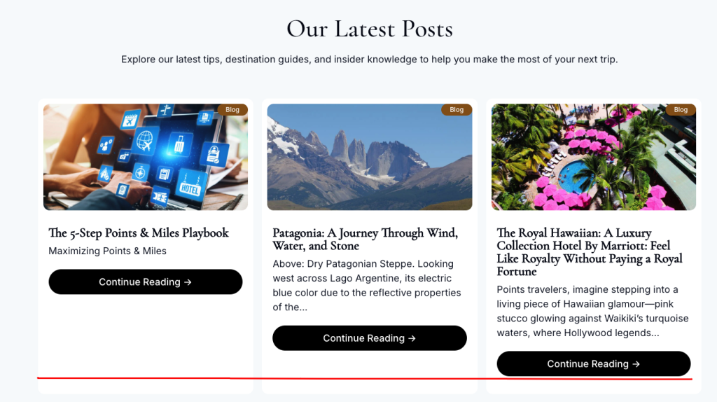
Picture a typical 3-column blog grid. Each card has:
- A featured image
- A title (some short, some long — wrapping to 2 lines)
- An excerpt
- A “Continue Reading” button
Because titles and excerpts vary in length, the total height of each card ends up different. And by default, the button just sits right after the text — wherever that happens to land. On a row of 3 cards, you get buttons scattered at three different vertical positions. It’s a small detail, but it makes the whole layout feel unpolished.
You might me interested in: The CSS if() Function Guide: Inline Conditionals have finally arrived
Why This Happens
Elements in a normal block layout only take up as much height as their content needs. There’s no built-in way to say “push this button down to match the tallest card in the row” using default CSS you need Flexbox to control the internal layout of each card.
The Fix: Flexbox + Auto Margin
The trick is a two-part fix:
- Turn each card into a flex container running top-to-bottom (
flex-direction: column). - Give the button (or its wrapper)
margin-top: autoso it gets pushed all the way to the bottom of the card.
Here’s the CSS:
.card {
  display: flex;
  flex-direction: column;
  height: 100%; /* important when used inside a grid */
}

.card-content {
  flex-grow: 1; /* pushes everything below it down */
}

.card-button {
  margin-top: auto; /* pins the button to the bottom */
}
And a simple HTML structure to go with it:
<div class="card">
  <img src="thumbnail.jpg" alt="Post thumbnail" />
  <div class="card-content">
    <h3>Post Title</h3>
    <p>Post excerpt goes here...</p>
  </div>
  <a href="#" class="card-button">Continue Reading</a>
</div>
Making Sure the Grid Itself Stretches the Cards
This trick only works if the cards are actually allowed to stretch to match each other’s height in the first row. If you’re using CSS Grid or Flexbox for the container, make sure you’re not accidentally shrinking cards to their content size.
.grid {
  display: grid;
  grid-template-columns: repeat(3, 1fr);
  gap: 24px;
  align-items: stretch; /* default value, but good to be explicit */
}
If you’re using Flexbox instead of Grid for the container:
.grid {
  display: flex;
  flex-wrap: wrap;
  gap: 24px;
}

.card {
  flex: 1 1 300px; /* grow, shrink, base width */
}
Why This Works
flex-direction: column turns the card into a vertical stack, and Flexbox treats margin-top: auto as “take up all remaining free space above this element.” Since there’s no content after the button, that free space gets pushed above it — effectively gluing the button to the bottom of the card, no matter how much content sits above it.
This is much more reliable than trying to set fixed heights on titles or excerpts, which breaks the moment your content changes even slightly.
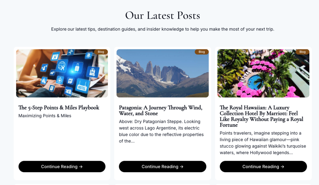
Result
After applying this fix:
- All buttons across a row line up perfectly at the bottom, regardless of title or excerpt length
- No JavaScript needed
- No fragile fixed-height hacks that break with content changes
- Works responsively across grid and flex layouts
It’s a tiny CSS trick, but it makes a blog or product grid instantly look more professional and consistent.
FAQ
Q: Does this work with CSS Grid instead of Flexbox for the card itself?
A: The container (the grid of cards) can absolutely use CSS Grid. But the individual card still needs display: flex; flex-direction: column; internally so margin-top: auto works on the button.
Q: What if my card has multiple buttons or a footer with extra meta info?
A: Wrap all the bottom elements in a single container and apply margin-top: auto to that wrapper instead of the button directly.
Q: Will this affect mobile / single-column layouts?
A: No. On mobile, when cards stack in a single column, this fix still works fine since each card manages its own internal height independently.
Q: Can I use align-self: flex-end instead?
A: align-self controls horizontal alignment in a column flex container, not vertical position — so it won’t push the button down. margin-top: auto is the correct tool here.


Leave A Reply